Diamonds and wine: Briton Laurence Graff, chairman of Graff Diamonds International, is one of the world’s most famous jewellers and a wine estate owner in South Africa, at the “Delaire Graff Wine Estate”. For the labels of his wines, he expects perfection, minimalism and elegance in one. His branded wines rank among the absolute luxury of South Africa, just like his diamonds. Vollherbst has been printing their labels for ten years. A highly demanding client, whom Vollherbst can always delight with its long experience and innovative expertise.
Delaire Graff Wine Estate is, in the truest sense of the word, one of the “jewels” of South Africa’s wine regions. Laurence Graff, Chairman of Graff Diamonds International, bought a magnificent estate in the Cape vineyards in 2003. The world-renowned visionary from the diamond industry wanted to turn the new Delaire Graff Estate into South Africa’s most sought-after destination for art, hospitality and wine. He groups his wines accordingly into three segments: Luxury, Premium and Icon. In 2012 Graff Diamonds carried out a relaunch. This created the opportunity to make Graff’s heritage more present in the brand. “Sunrise Brut Cap Classique” received the first label introduced under the newly designed logos. Named after an 118-carat yellow diamond mined by Graff, the labels of “Sunrise Brut Cap Classique” set the tone and the design for a complete overhaul of the brand.
“We know we can bring any idea to Vollherbst and ask them to make it real. As a rule it even turns out better than we expected.”
Katherine Harris
Delaire Graff
The challenge
Understated luxury is no contradiction
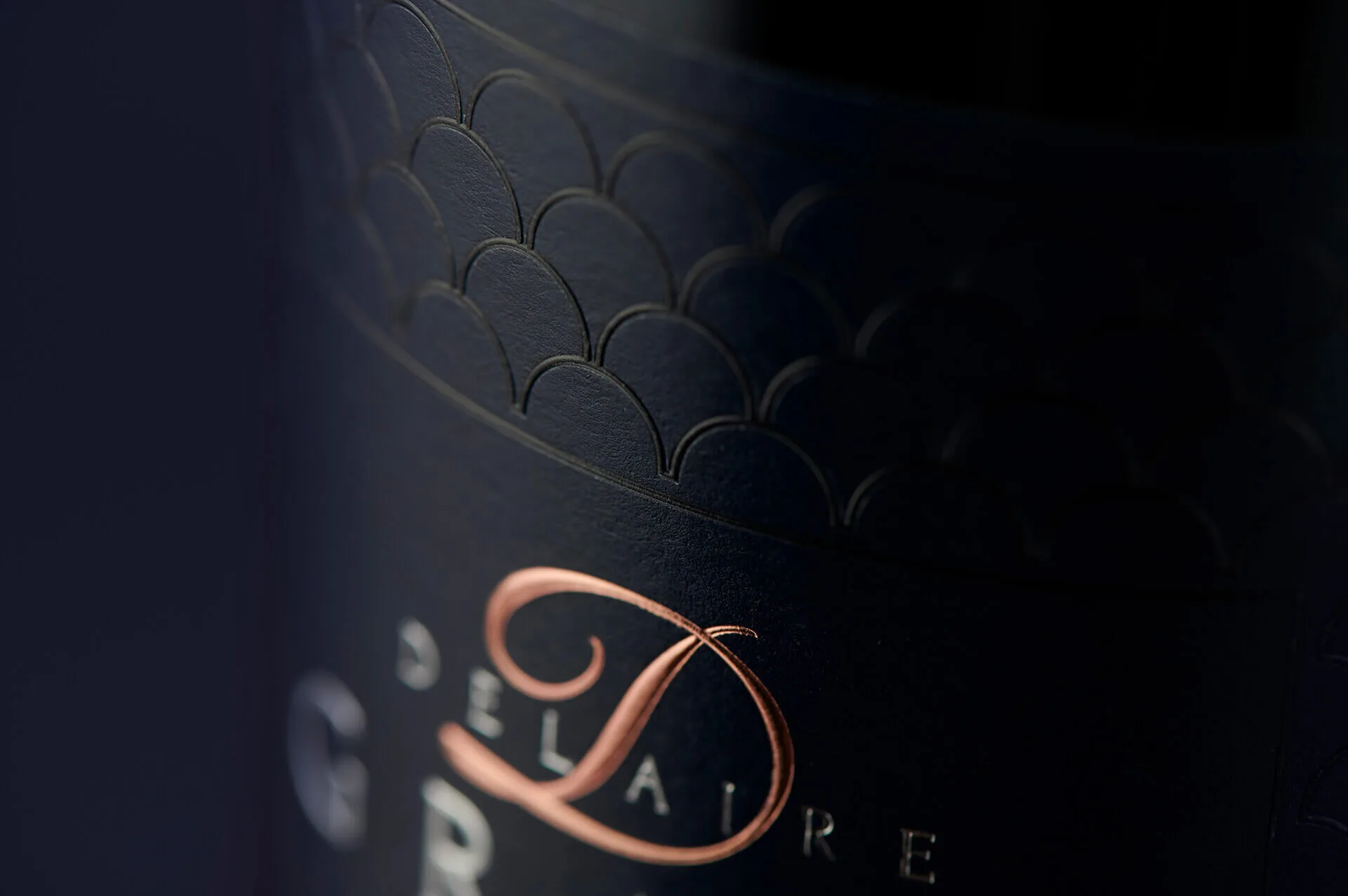
Delaire Graff Estate was initially unable to find a local printer that could convey the luxurious feel they wanted. Particularly in view of the detail required. For the details on the label to really come into their own in print, an elaborate process with multi-stage relief embossing and transparent hot foil stamping was required. Katherine Harris, Wine Sales and Marketing Manager at Delaire Graff Estate, says: “Could we have found someone in South Africa to produce these labels? Probably not, at least not nine years ago.” During the redesign of the labels, the brand moved away from a classical design towards a more modern and refined look. The Delaire Graff symbol, the scallop shell, became a strong reference in the design. The earlier style, held in classic white, was dropped. The key phrase “understated luxury” was the brief, while the labels in the range also had to impress the wine drinker. The “Laurence Graff Reserve” is regarded as one of the most expensive Cabernet Sauvignons in South Africa. The labelling and print solution had to be equal to that challenge. And there were several! Several elaborate relief embossings are needed to produce the desired texture. In the case of the “Delaire Graff Sunburst Noble Late Harvest” (NLH), several further finishing processes were added: relief embossing and the use of two hot foils, which increased the complexity still further. Each time a new finishing unit was made ready, millimetre-precise work was required so that the plate was pressed in exactly the same place. The “Laurence Graff Reserve” posed a particular challenge: the label had to be held in black. Black is a difficult colour to work with, because the paper either has to be printed in black, but then loses its finishing or becomes too glossy. It was a challenge to find a black paper on which the embossing would hold.
Approach
Knowledge was the key to success
Katherine Harris: “Vollherbst has incredible experience and fantastic access to the printing and finishing repertoire. I have never met anyone who can do that. They are true craftspeople in their industry.” Starting with the paper options for the black label: Vollherbst immediately presented various options for the brand’s Cabernet Sauvignon. The estate could also rely on Vollherbst’s experience when it came to the details, Katherine Harris says: “With the delicate embossing, Vollherbst knew how to master this challenge without damaging the label.” Vollherbst’s advice was also decisive when it came to realising the estate’s dreams and ideas for the “Sunburst NLH”. The details required several processes. Again there was concern that each process could diminish the quality of the texture. Vollherbst had the solution: a special relief embossing combined with a transparent hot foil stamping. This allowed the “Jakobsmuschel” icon to stand out in 3D quality. Vollherbst made labels of an extra class! They are unobtrusive luxury without glittering foils or spot UV applications. The haptics offer the consumer a unique experience. All of these agreements were managed over a distance of some 13,000 km – between Delaire Graff Estate and Vollherbst’s headquarters in Germany. Through regular communication. Katherine Harris explains: “Normally, as a client, you do the press approval in person on site. To have them printed in Germany, you have to have a great deal of trust in your print partner – and Vollherbst was wonderful!” Vollherbst sent label samples, or “proofs”, that addressed the finest print details and differences, and every label was tested several times.
Personal Touch
Vollherbst has been the print and finishing partner of Delaire Wine Estate for ten years. A relationship that began with a small run of 6,000 labels and has since grown to 40,000 labels. That trust is made possible by the personal attention and care Vollherbst brings to the projects. Katherine Harris: “We know we can bring any idea to Vollherbst and ask them to make it real. As a rule it even turns out better than we expected. The Vollherbst team is enthusiastic about every project and they are very proud of their work. Because they are so personally connected to their industry, they create such beautiful products. They are streets ahead of their competitors.”
Start your journey to a unique label
The path to your ideal label takes just three steps with us. Select your industry so we understand your specific market requirements. In the second step, you define the finishing that will make your product an eye-catcher. Finally, we only need your contact details for a personal consultation. Together, we lay the foundation for a result that makes your brand tangible.
This website is registered on wpml.org as a development site. Switch to a production site key to remove this banner.
Vollherbst EnglishYou are viewing published English Gold. Click Proofread to edit this page.ProofreadChange log